TraveMed
Project Overview
Travemed is an app creates to help people find medical care service such as a hospital, Clinic or pharmaceutical nearby whenever needed even they are overseas or somewhere unfamiliar. Not only that, the end-users-searchable include waiting time for emergency room and if they are alone, Uber will be their choice to transport them to the care services when needed. In addition, to offer those options, Travemed also offers a user to measure their body temperature from the app. To measure, customers simply place their thumb on the phone screen to detect your body temperature and wait for the result. The good thing about this app is world-wide searching.
My Role
Fire One One, Bangkok Thailand gave me a task to creating a mobile app conceptual design for a healthcare category. My responsibilities are Research, Persona / User flows, prototype and user testing. Those responsibilities based on two things: the quality of my work, and how well within my ability to meet the deadlines.
TIME TABLE
According to this task has to be completed during my vacation trip in Thailand, and consequently, the timetable is very tight I have to plan a project, do time management for each step, so I can get a good result even though this is just a test.
This conceptualization of this project to presenting in the final deliverable took 3 days-The design challenge was presented to Fire One One, Bangkok Thailand on November 7, 2017.
THE APPROACH
Focusing on the goal. Although this task is for a design challenge but it has to be able to develop the functionalities and features in reality. I was thrilled by the opportunity to create something more meaningful.
Inspired by Lean UX
To make my project faster. I emphasized on rapid sketching, prototyping, high fidelity mockups and user feedback substantially focus on the actual experience being designed. The goal is to get the main problem of the idea and I can visualize the workflow quickly.
Define the problem—->Concept—>Design—>Develop—>Test
The Problem Statement
You may get sick or injured without warning while traveling and getting health care aboard may not easy as you think. Those experiences can be an incredibly frustrating it’s especially when you are travel alone and you don’t know where to find doctor or medical service nearby you.
THINGS TO CONSIDER:
How might we: Improve the experience of searching medical service quicker such as locate medical service nearby, see distance and know type of the service.
How might we: Have option to show waiting time for an emergency room. So they can decide which location they should go and how long will they receive a service.
How might we : Help user to get to medical service location as needed especially when they are alone.
MY GOAL
Getting sick or injure while traveling is something that unpredictable even though you already prepare. I made it my goal to help searching medical service more efficient even though you are alone or you are in somewhere that unfamiliar could help you less worried.
Persona
Due to the short time constraint of the project I was only be able to interview 3 people. My persona hypothesis consisted of three different quintessences which I used to simplify about what users needs, desires and differing circumstances of use. Limited timing meant that I needed to be efficient conducting user research and collecting feedback. Below are my questions for my initial user research.
1. Do you normally prepare medicine when you are traveling?
2. How do you find a medical service when you get sick in oversea?
3. Can you tell me what was your experience when you receive a medical service in oversea? Good and Bad Why?
4. If you have used websites or apps Which apps and websites do you use?
Interview users were conduct to gather quantitative data on searching information online, problem finding a medical service and kinds of technology they used.
DEFINE
With the insights I gather information from user interview how best the features / functionality I can plan to implement user experience and my design to achieve user’s goal.
AFFINITY MAPPING
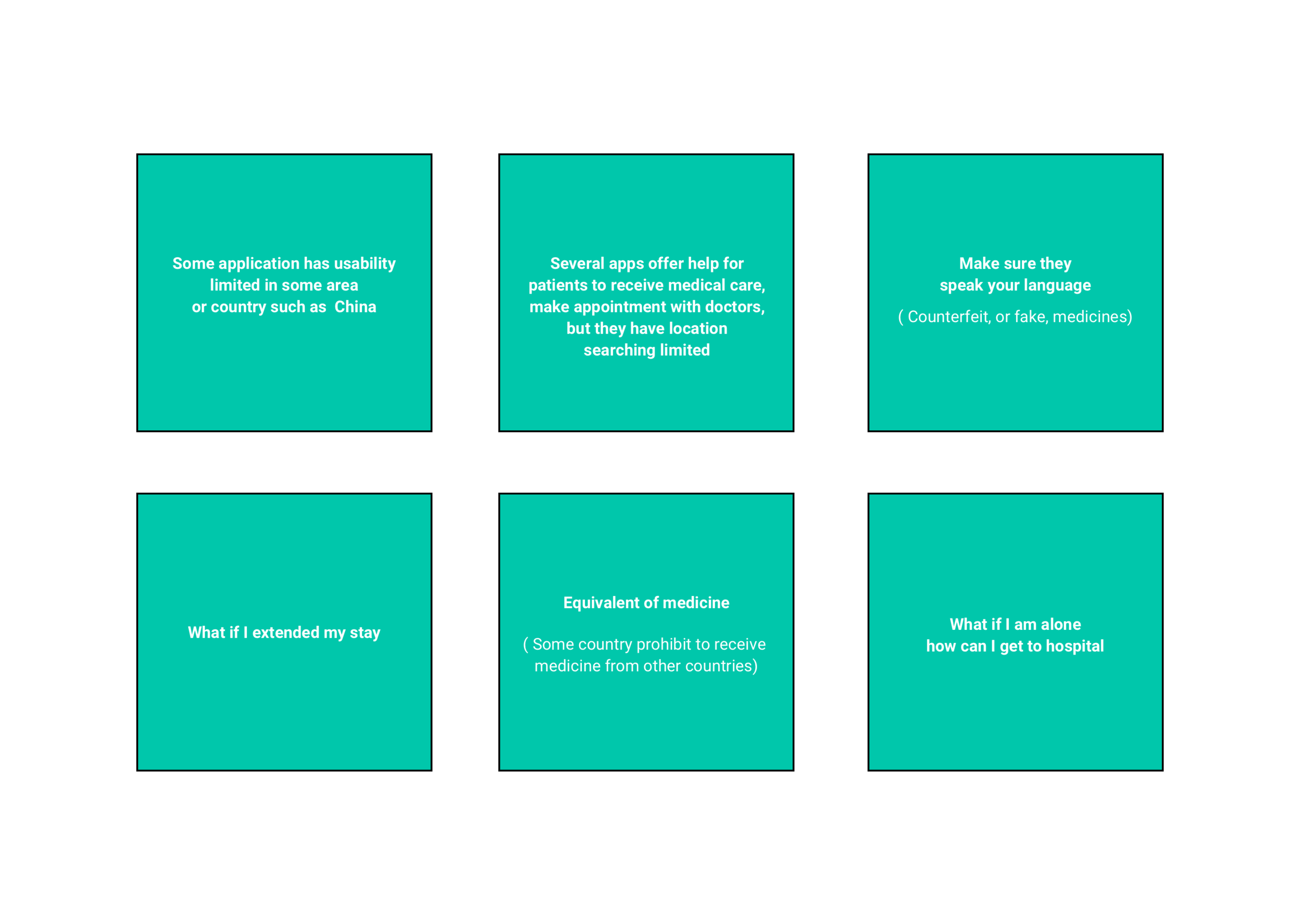
Some of the valid data I got from what users are saying. I quoted and highlighted from answers, one-on-one interview. Card sorts were used to determine the problem of different situation during the time users are trying to search or receive medical service nearby.
FEATURES PRIORITIZATION
It’s time to define and prioritize product feature. Due to the short time constraint of the project I would like to focus on the feature that make up basic working and rank only the importance feature to the users.
USER FLOW SKETCH
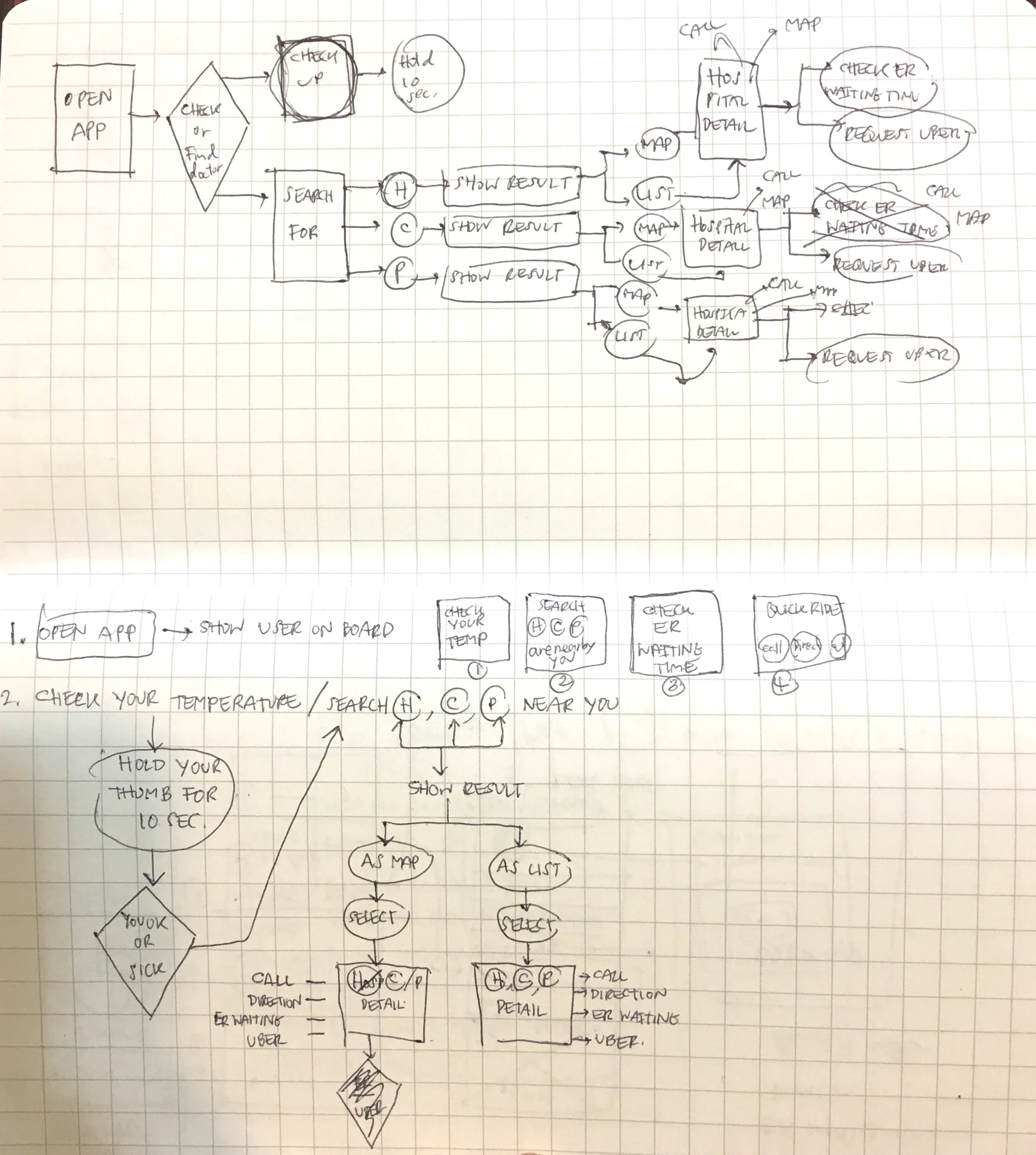
Before I begin the visual design process, I wanted to highlight what users need and show what is being considered the most for them. From the interview result, Here is my user flow.
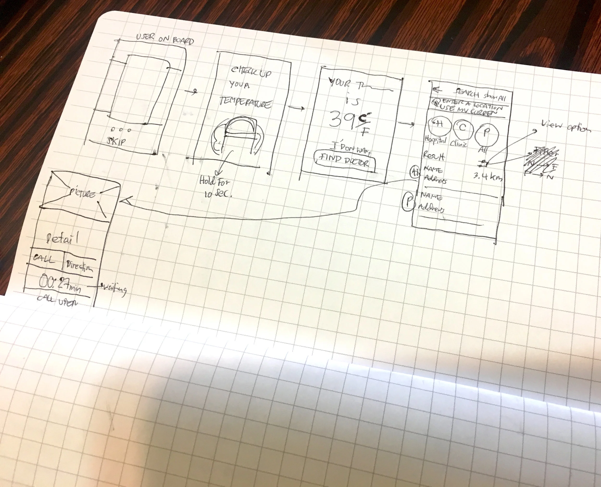
HIGH FIDELITY MOCK UP: TRAVEMED MOBILE APP
User testing
TraveMed is a mobile application designed to help the searching medical care service such as hospital, Clinic or pharmaceutical nearby. It provides the end-users-searchable include waiting time for the emergency room in addition to being alone, Uber will be their choice to transport them to the care service when needed. Moreover, offer those options, Travemed also offers the user to measure their body temperature from the app.
TraveMed mobile app usability testing with the first prototype conducted on-site with the potential users and portable equipment. Before the session begins, I informed participants of the purpose of the test and asked them to complete the following tasks. I used Marvel to do a quickly interactive prototype for the user testing.
Measure body temperature
Find a medical help nearby
Share information with relative or friend
Request Uber service
Sessions are recorded and analyzed to identify the problem and situation that occur during the test for improvement to the mobile application. The session captured each participant’s navigation, emotional, task completion and overall satisfaction.
Post-Task scenario subjective measures included.
How easy it was to use the product.
What the participant liked most?
What the participant likes least?
What the participant liked most
All participants like the conceptual for this application because it is easy to navigate or search medical location nearby when they are at unfamiliar location or even they are alone.
Uber is a good idea when the users are not familiar with the location, so local driver will take them to the medical service.
What the participant liked least
At the beginning there is a confusion over user on board section since there are two ways to experience how to use the product. The user interface component changes some aspect when user interacting with it. The app has “ Learn more” and slide image option to explore how to use the product in spite of the fact that these elements are the same functions. It should assure to user to be more efficient by making interactive content more predictable, focus on the user’s first experience with the product that should be.
Users have bad experience how to make sure their body temperature result is accurate. During the user testing one participant wants to re-assure that he is able to measure his temperature again. From the the first prototype, he can’t do that.


