PROBLEM
Currently, this company is using an out-dated software, alongside the design and system are dated, and many customers complain about it's not intuitive and inefficient shopping experience when it comes to checking out process. When their current multi-page checkout page refresh, the problem often find plenty of red asterisks indicated mistakes and information that already filled in had disappeared. According to that problem can decrease in sales and customers satisfaction.
THE CHALLENGE
Our goal was to improve the usability and visual of Shopping cart and Checkout page, while at the same time, be able to provide proficiency in features which are likely to increase sales and customer loyalty and standpoint that previously overlooked.
OUR MAIN GOALS WERE TO
- Implement shopping cart page layout which customer can see all of their significant information in one glance, such as order summary, shipping address, shipping method, payment options, quantities, prices and even thing like promotional code.
- Give customer time efficient when it comes to checking out by creating One PageCheck out. The process should be quick and easy and allows customers to have more confident that everything is correct or ready to be edited at any time while they are filling out information and more likely to complete their order.
MY ROLE
I led the design team of redesigning the customer shopping cart and checkout experience. My responsibilities were experience strategy and design of the responsive layout: Desktop, Tablet and Mobile, created and lead the UX / UI work, conducting user interview and presented these to the company owner. I also worked alongside with my project manager and developer.
THE DISCOVERY
We tested the existing shopping cart and check out page with 3 participants, who they are our customers at our flagship store, in the most problematic online purchasing from start to finish. User testing sessions involve 3 participants, a computer or mobile device, and myself who provides the participants with details to complete. For having an ability to make a rational judgment while they are shopping, I take lavish notes by keeping my eyes peeled of issued, observed their ability to measure how do they accomplish their goal as an online customer and what problem matter. Before I could jump into designing, I create user flow, define the problem to understand customer insight when they are shopping. So I take a screenshot to understand the frustration that participants experience with our site.
EARLY USER FLOW
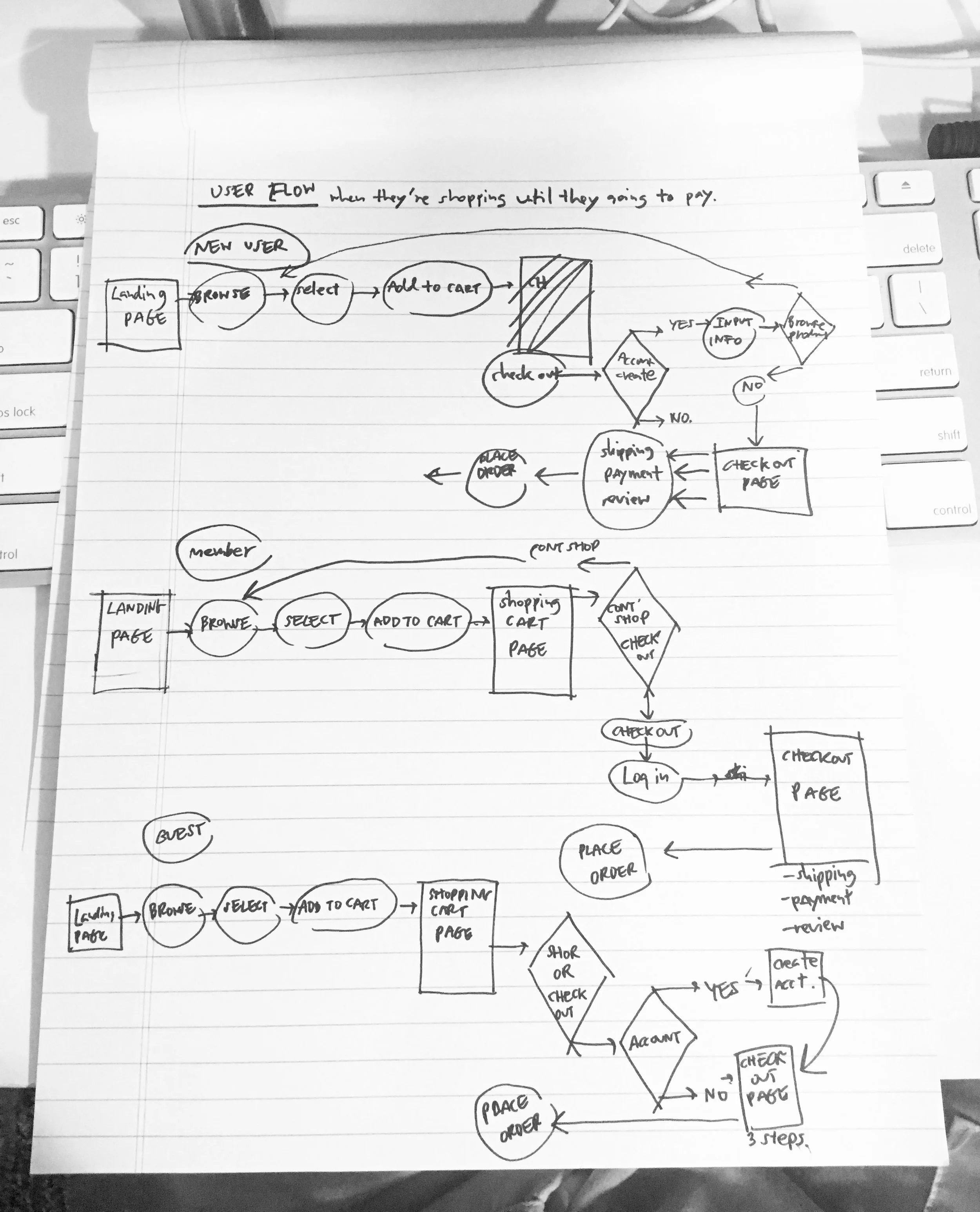
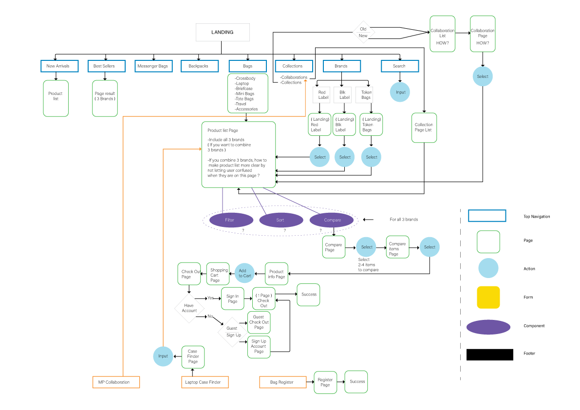
Once I figured out what the critical pages and paths are, so i highlighted into ia model.


FURTHERMORE, I HAVE COLLECTED CUSTOMER INSIGHTS FROM USER TESTING.
1. Creating an account
CUSTOMER INSIGHT
“I was annoyed when I had to fill out unnecessary information.”
CURRENT DESIGN
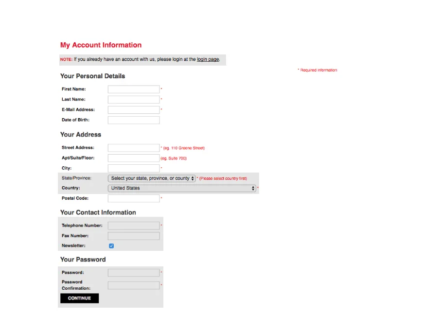
PROBLEM
-There are too many personal informations required to fill out and some of them are not necessary such as fax number and date of birthday. Most likely, a customer would abandon at this point, if not much easier in the process.
SOLUTION
-If the user has to create an account, make it a short form of asking the user to put only necessary information.
HERE IS THE FINAL RESULT.
2. Shopping Cart page
Not only the shopping cart could work nicely if is created with a good layout but also concern more about the detail that could help online user experience become better.
CUSTOMER INSIGHT
“i don't know whether my shopping cart include tax or not."
CURRENT DESIGN
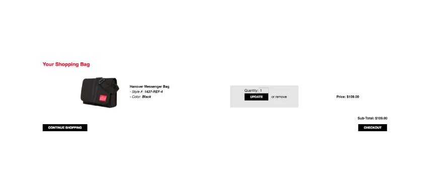
SOLUTION
-Redesign the layout more appealing and easy to read by adding relevant information and functions, making CTA bigger, provide add, update, remove and change quantity incase customer change their mind.
-Making "continue shopping" quickly to see and close to check out button. The less time that customers have to spend looking for the sooner they will take action.
-Adding Cross sell to bring more value in the shopping cart.
HERE IS THE FINAL RESULT.
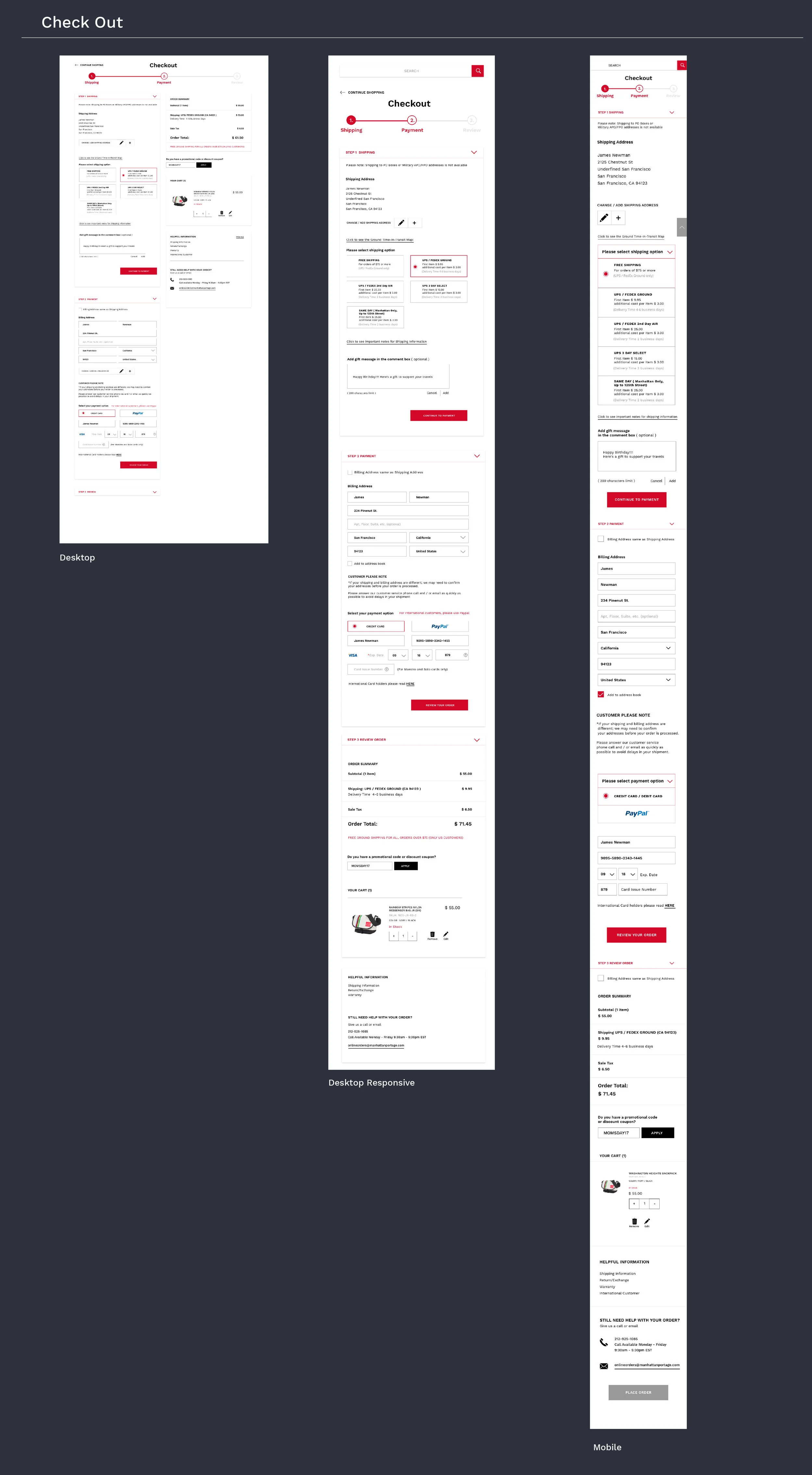
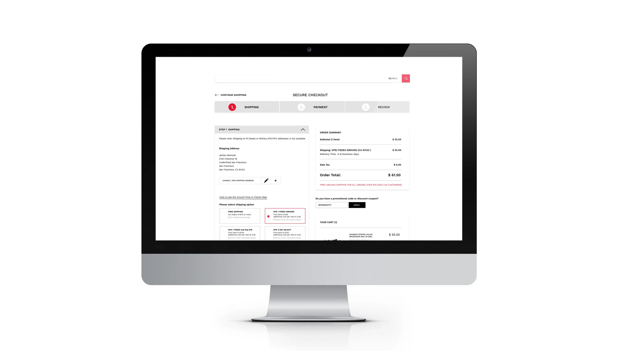
3. Checkout page
One participant tried to check out as a guest; something just doesn’t feel right. Intentionally the system brought her to create an account page instead of checking out. According to a system requirement, she had to fill out information, and later she's been waiting for 30 minutes to get the email confirmation, but nothing sent to her email inbox and spam inbox. It causes participant disconnected from the check out page.
CUSTOMER INSIGHT
“WAITING TO RECEIVE AN EMAIL CONFIRMATION AFTER CREATED AN ACCOUNT WAS TAKING SO LONG, IT MAKES ME FRUSTRATED. I CHECKED MY SPAM INBOX, BUT NOTHING."
I was surprised by observing participants behaviors and the problems we found. When customers want to buy a product online, they want shopping and checking out process to be quick and easy, without any annoyance issues. So they expect the process to be more efficient. If they were having trouble with our system, so the conversion rate will go down afterward, and sale will decrease gradually. Even though we clearly provide payment option, but it's not always readily obvious to people who don't read the text carefully.
CUSTOMER INSIGHT
“Apparently, When it comes to payment option, credit card fails to notice; PayPal option is obviously to see.”
Before I could jump into designing, I create user flow, define the problem to understand customer insight when they are shopping. So I take a screenshot to understand the frustration that participants experience with our site.
CURRENT DESIGN


SOLUTION
-Design step-by-step or one page check out and give the user a visual indicator of how far they've progressed. it makes them feel confident. Users need to be knowledgeable about where they are in the checkout process. Dissatisfaction can set in if the user thinks that the process is taking too long or putting them in limbo . If the customer can see a right direction to complete, they are more likely to follow through on the purchase.
HERE IS THE FINAL RESULT.