
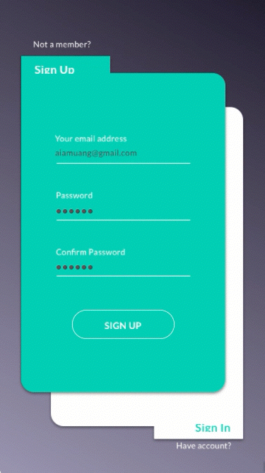
Day_001: Sign Up
The challenge is to design a sign-up page, model, form, app screen, etc. My idea wants to make thing simple and suited for actual use. So either you are a new customer or current will not leave the page.


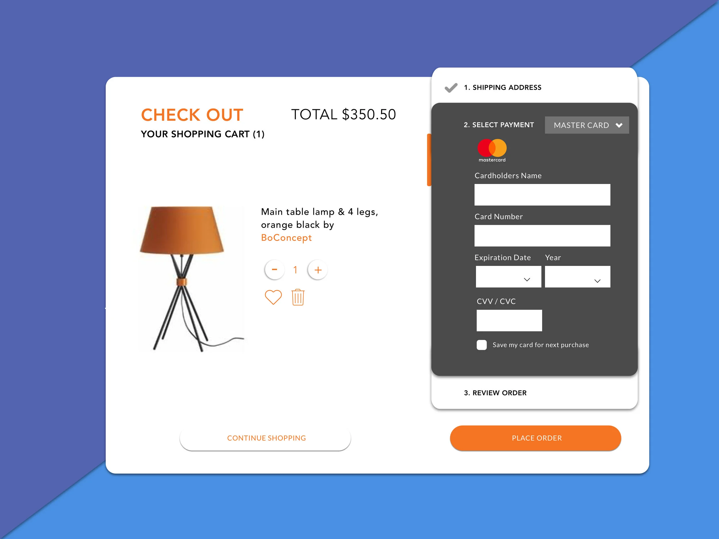
Day_002: Credit Card Check Out
The challenge is to design a credit card checkout form or page. I spent time a little longer because all details should be included. In e-commerce, three steps require users to fill in their pieces of information. For a smooth experience, I decided to create one-page payment check-out which presents all steps that users can see which stage of the checkout process they are on right now, how many steps would take them until the end also if they want to edit any information they can edit without losing their step.
Day_003: Landing Page
The challenge is to design Landing Page (above the fold). I chose to create the landing page of furniture’s website. I wanted to make a landing page that grabs customers attentions by placing a big product image on the center also add the most valuable piece of information such as name, product introduction, and price. That information can hold customers' attention throughout the entire site presentation to click and buy the product at the end.

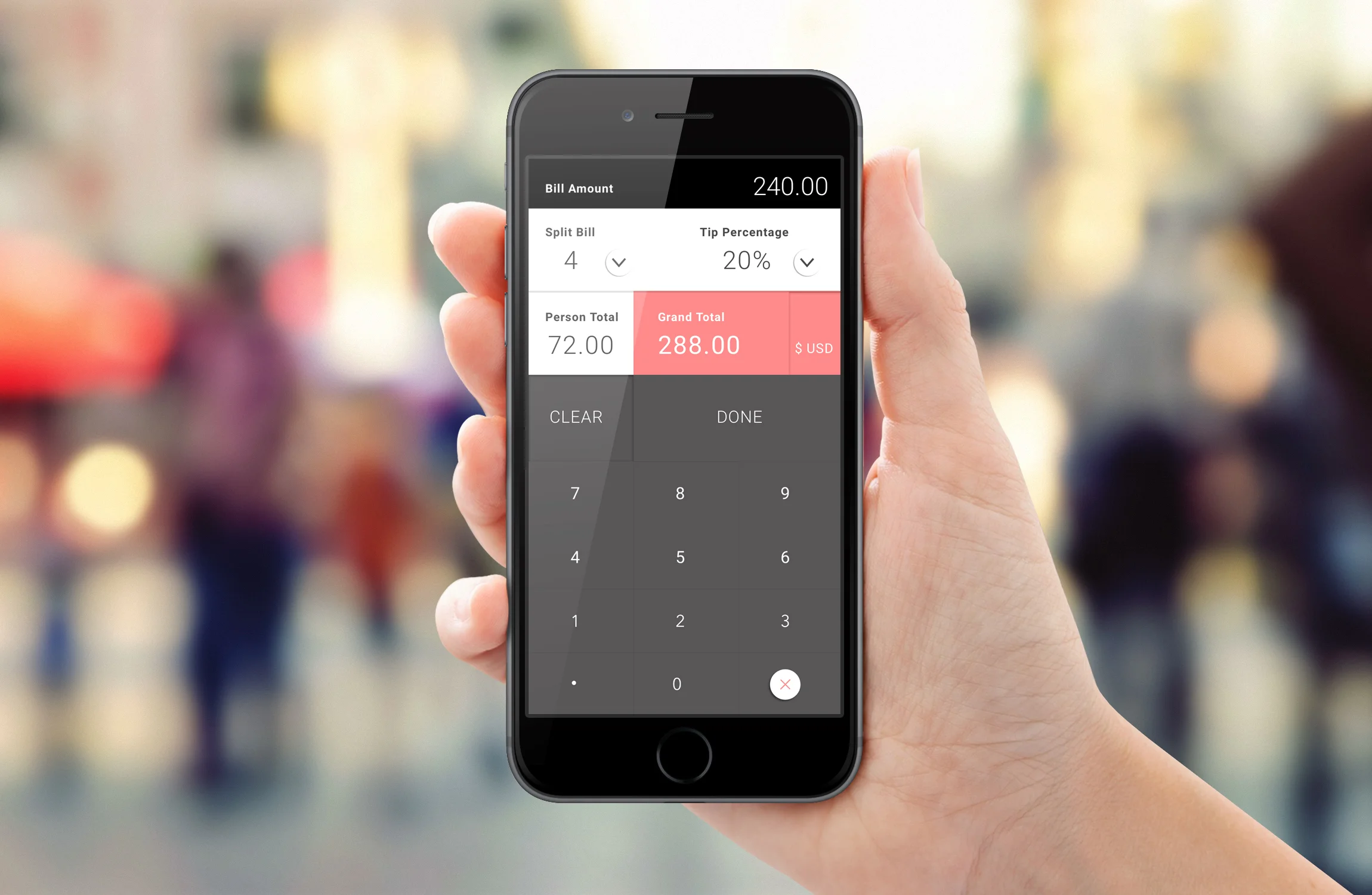
Day_004: Calculator
The challenge is to design a calculator. Standard, scientific, or specialty calculator for something such as a mortgage? Is it for a phone, a tablet, a web app? (It's up to you!)
SKETCH
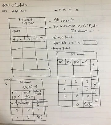
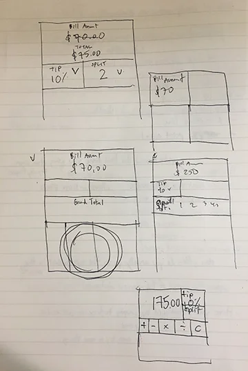
When I saw today’s challenge, I knew what exactly I would like to design. I’ve been using an app to calculate the tip amount and been thinking what if I can create how user interface to be more attractive and be used effectively when you need to solve the problem. Tip amount and how many people you would like to split could be adjusted by tapping and select suitable number. You can also change your system of money in general use in a particular country.
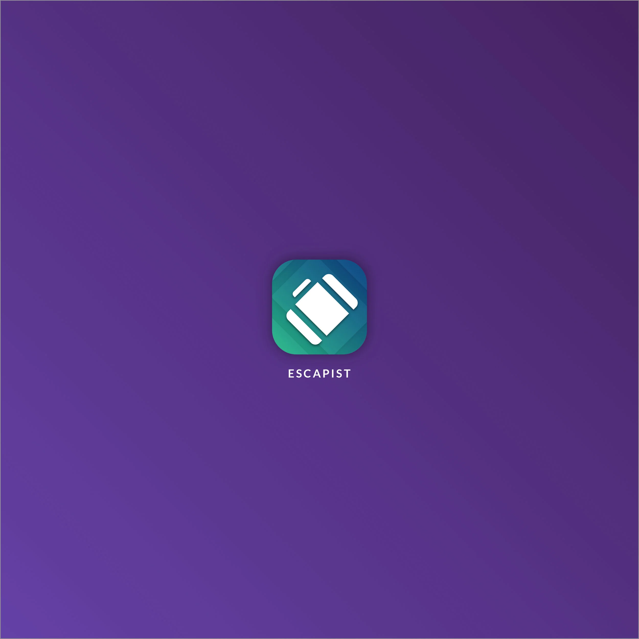
Day_005: App Icon
The challenge is to design an app icon. What best represents the brand or product? Or is it incredibly unique? Does it look great at a distance and does it stand out when put on your home screen alongside other apps?
I decided to create an icon for a travel app called Escapist that allows you to create a trip base on your budget range and destination. You can also invite/share with your friends if you would like to create a travel plan as a group. I choose the travel luggage as my idea because it is easy to understand about going for a trip.
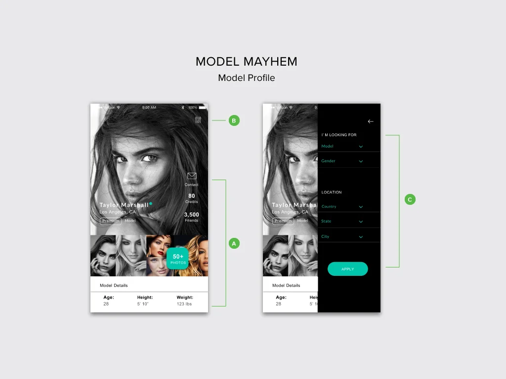
Day_006: User Profile
Design a user profile and be mindful of the most important data, names, imagery, placement, etc. Is it for a serious profile? A social profile? (It's up to you!)
SKETCH
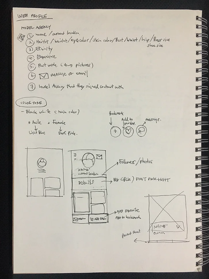
I decided to create a profile of modelmayhem since I've been using it when I'm looking for a model for my work. When opening their site both desktop and website has lots of content, and several levels of navigation and both are not easy to navigate; it seems a bit chaotic and does not appeal to look at it. The primary purpose of the model profile is to attract and grab users attention. Therefore, I would like users to have an experience by allowing them to easily see where they are, how they got information, and where they can go. A. The user will give the necessary pieces of information such as model name, location, photos, credit (liability) of a model. B. and C. Filter icon on the right allows a user to narrow down their search if they are looking for photographer, Male model also if they prefer any particular location. As a brand image, I still use their color scheme, which is black and green, to remind visitors when they are visiting the website.
Day_007: Settings
Design settings for something. Is it for security or privacy settings? Game settings? What is it and what's important? (It's up to you!)
I decided to create a setting for fitness since I am the gym goer. This app allows you to set up your daily workouts and create your custom workouts to help you get in a better shape fast. Step 1, the user will be able to set up which part of their body they want to exercise, Step 2, Exercise is categorized into three different intensity levels, so the user will be able to select the right intensity based on your fitness level and overall health.
Day_008: 404 page
Design a 404 page. Does it suit the brand's style? Is it user-friendly? (It's up to you!)
I decided to create a 404 page for Budget, a car rental company because the current 404 page is not clearly defined the service of Budget car rental website . My idea wants website visitors engage with usable information that will help visitor stay on the site and assist them properly.

Budget_Current404page
My main concern is I don’t want to scare users or make them feel even more frustrated when they are misguided or do something wrong so I came up with the design and feel that related to website service. I maintain the color and lifestyle image that are integrated on the service of the website, moreover I maintain branding by using the same logo, header so the design concept will help users recognize Budget website.
